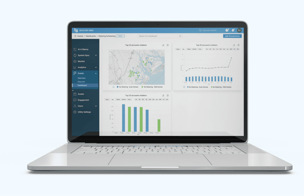
Redesigned the BEACON® AMA platform for smart water management, reducing support tickets by 35% and increasing user satisfaction by 85%.
My Role
UX Designer
Tools
Jira, Figma, FigJam
Responsibilities
Usability Testing
User Flow
Design and Prototype
Design Handoff
Overview of BEACON® AMA Web application
Badger Meter’s BEACON® Advanced Metering Analytics (AMA) provides real-time data and customizable analytics for efficient utility management. It detects leaks, optimizes usage, and drives consumer engagement, saving over 2 billion gallons of water annually.
Why Redesign?
The BEACON® AMA platform redesign was driven by user feedback from customer support tickets highlighting usability challenges to resolve critical pain points, and optimizing platform functionality.
Why did the product team prioritize the “Events” redesign first?
Events are crucial for water utility companies as they enable real-time monitoring of water flow and device performance. By detecting anomalies like leaks or equipment malfunctions through events, utilities can take immediate action to prevent water waste, leading to significant conservation efforts and operational efficiency.
Success Metrics
85%
User Satisfation
78%
Report Feature Adoption
35%
Reduced Support Tickets
Overview of Events Pages
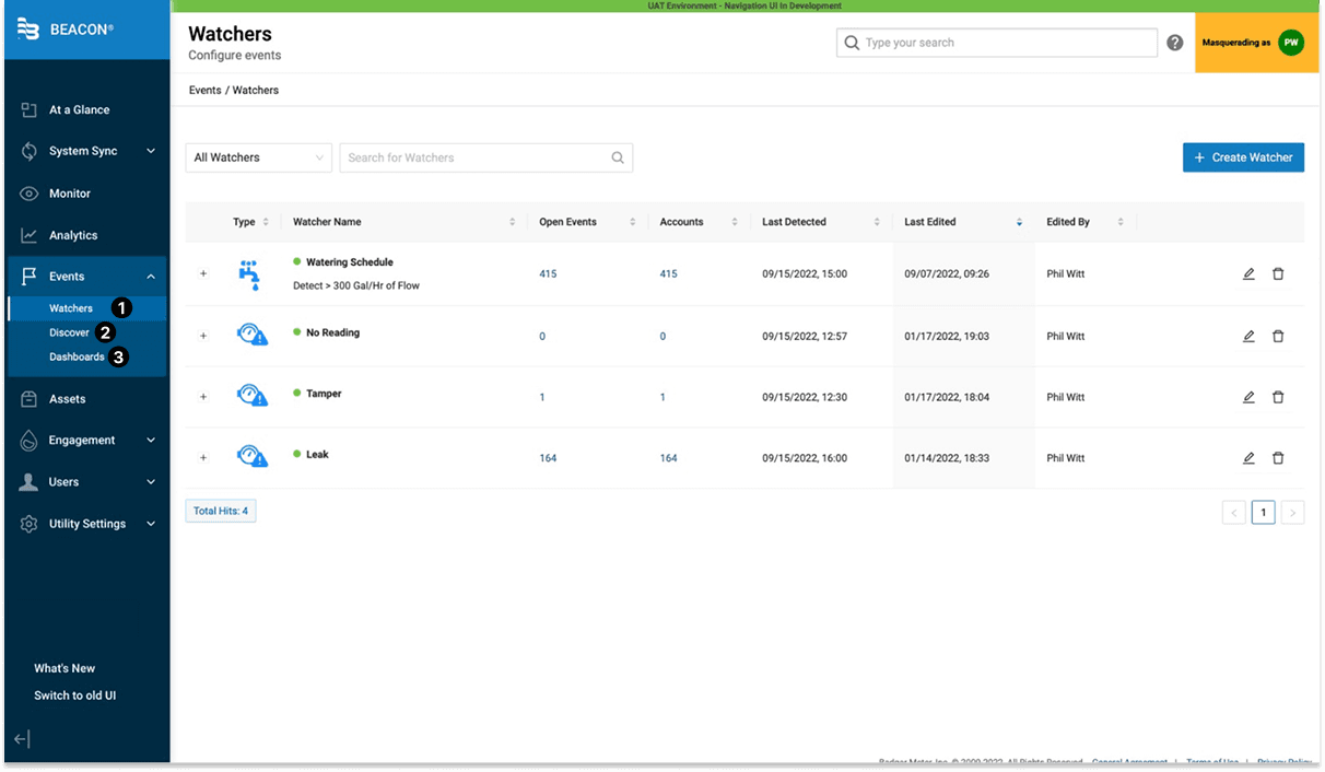
The Events feature gives you control over thresholds and parameters related to data from networked meters to operate efficiently.
It consists of three sub-parts:
1
Watcher's
Monitor important system events (for example: major leaks/ continuous flows, reverse flows, etc.)
2
Discover
Explore multiple accounts with active events
3
Dashboards
Visualize event trends via customizable dashboards
Understanding the User
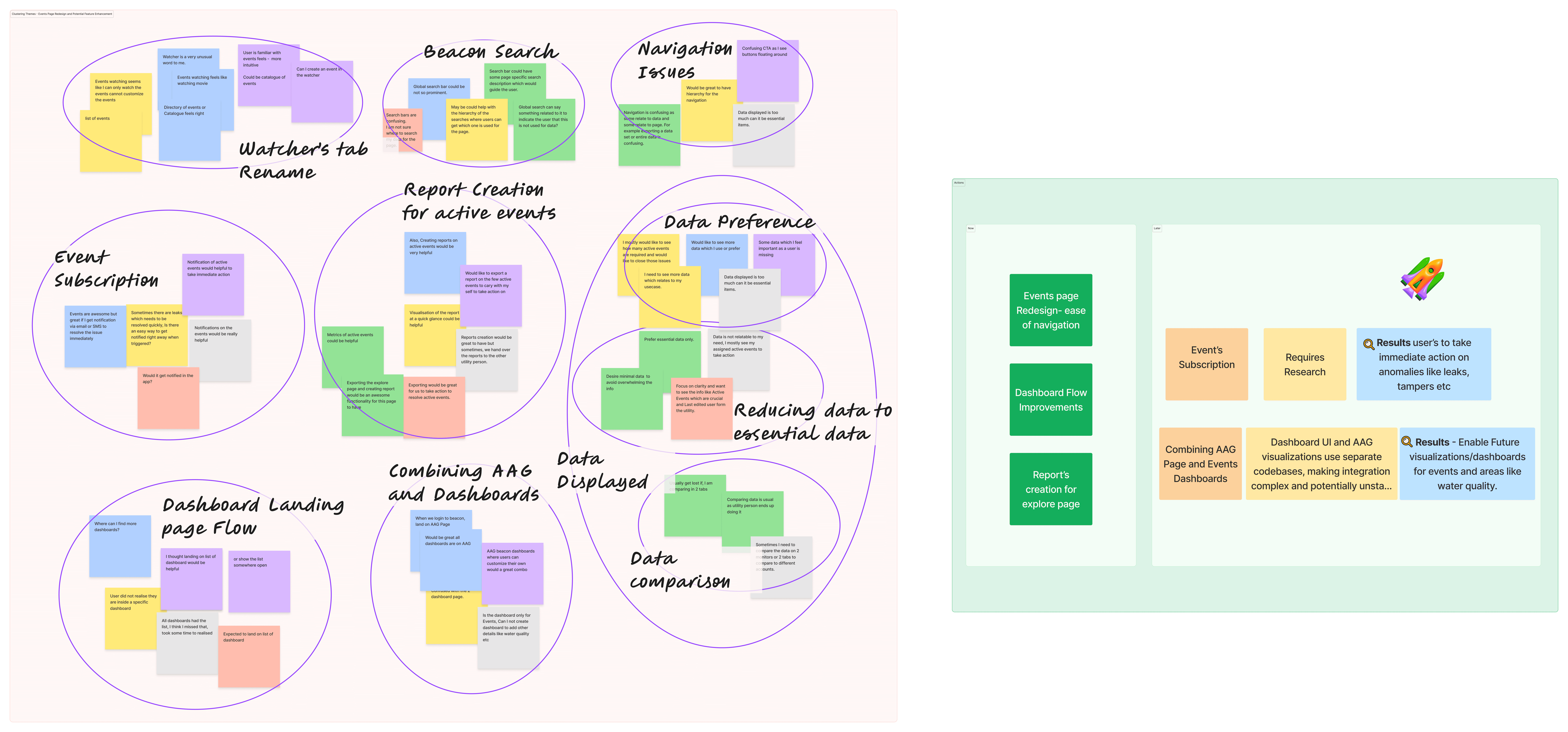
I conducted qualitative research for the Beacon project, creating test scripts to guide usability testing.
Six users from two utility companies participated, selected based on their active use of the Beacon platform and regular interaction with utility customers.
I synthesized the findings into test reports, categorized issues by severity, and prioritized them for action.
Research Insights
67%
Desired Clearer Navigation
50%
Desired to compare data
75%
Struggled to find dashboards
65%
Desired to create and export event reports
83%
Wanted event alerts for immediate action
How Might We..
improve the Events screens to make sure that users can navigate easily, can track, manage and visualize information seamlessly?
Alignment of Prioritization
To prioritize high-impact features quickly, I collaborated with the PM and engineering teams to create an MVP release plan. Using research insights and user workflows, I developed a journey map centered on “Dashboard Flow,” “Report Creation,” and “Event Alerts.” We decided to redesign the Events page, focusing on the dashboard and report creation, based on current research. Additionally, we identified the notifications feature for further research, highlighting a future opportunity to attract and retain customers.
Next, I listed out the moving parts that would make up the end-to-end user experience on Beacon and aligned with the client to prioritize these 3 main areas for the prototype according to our project timeline:
1. Bring clarity to Event Pages and ease of navigation through new content headers.
2. Identifying the habit loop for Dashboards via user journey and crafting the end-to-end experience around it.
3. Give users the ability to create and export reports on the discover page.
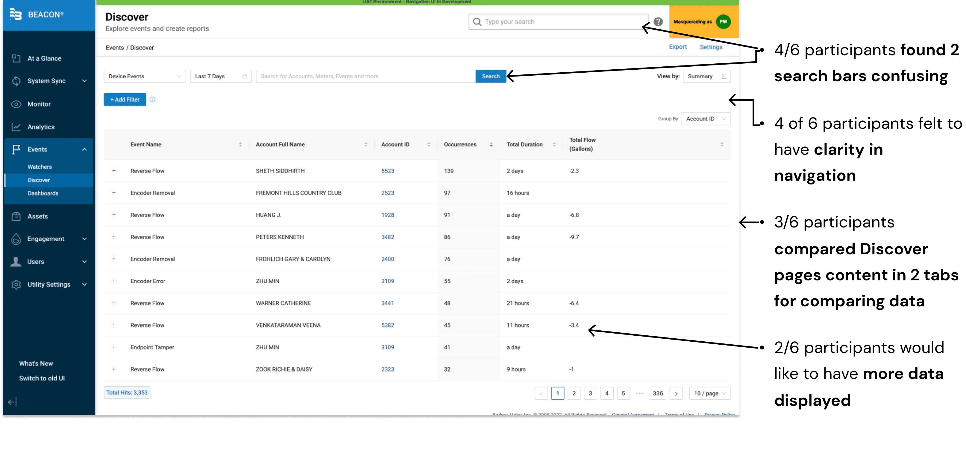
Analysis of before pages
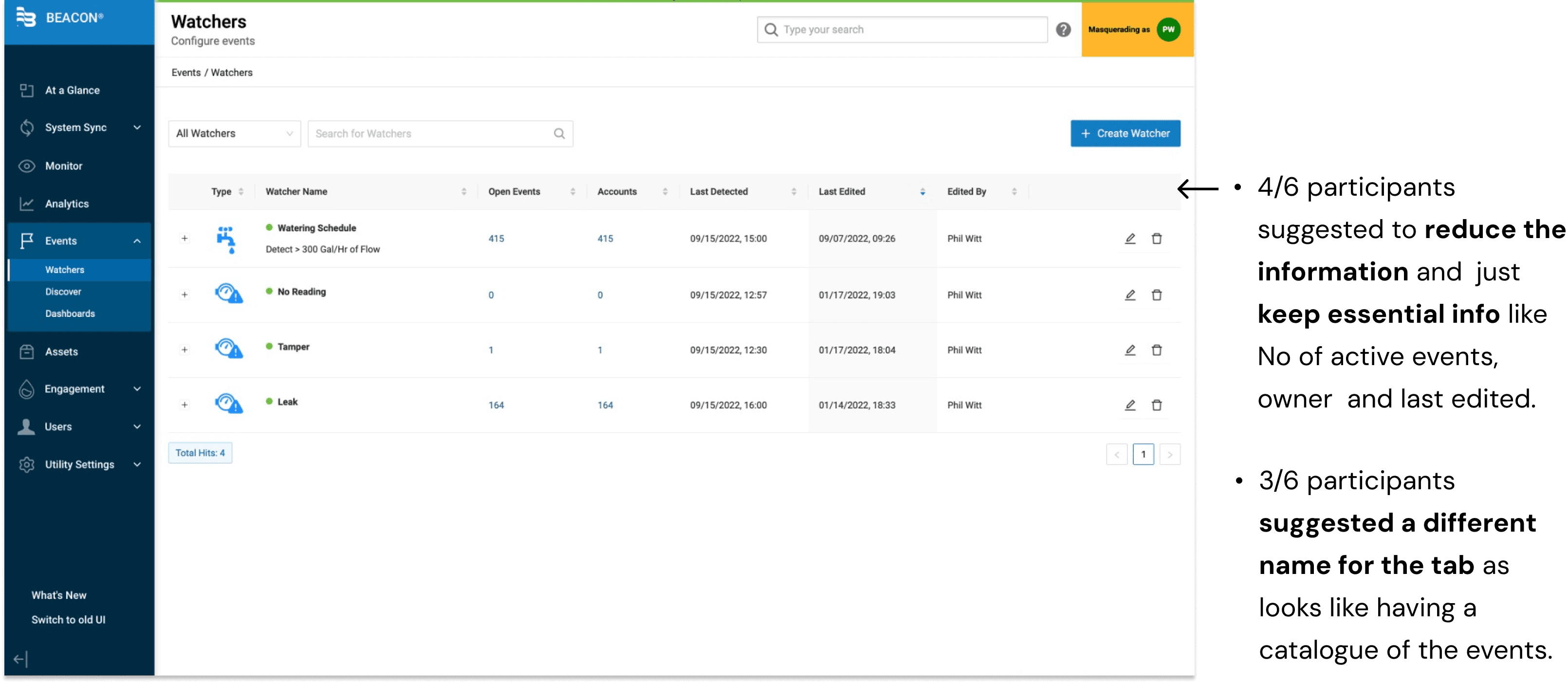
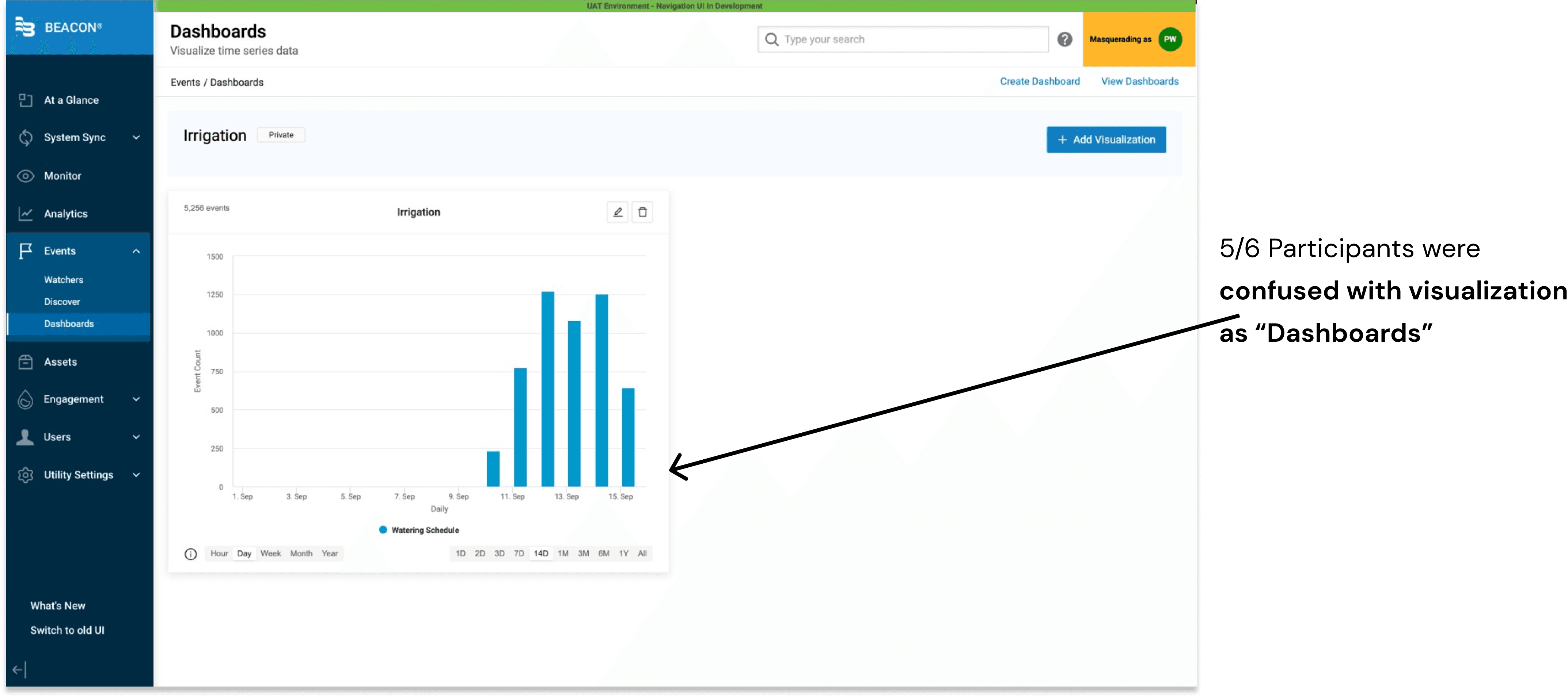
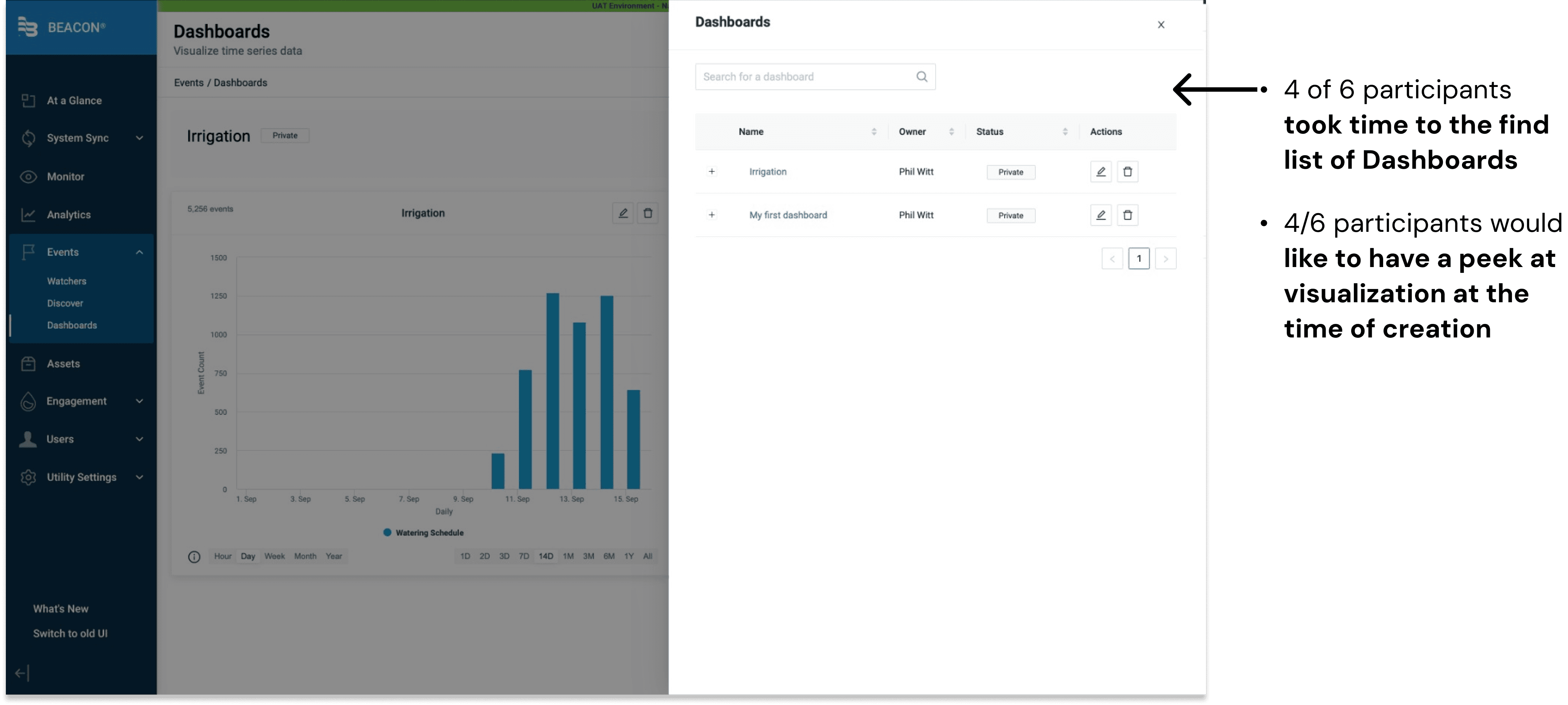
Solutions & Design Decisions
Explore Page
Ease of systematic navigation
The Discover tab has changed to Explore, as users find it's more about delving into data than just discovering it.
It involves exploring details on affected meters and creating/exporting reports for further investigation.
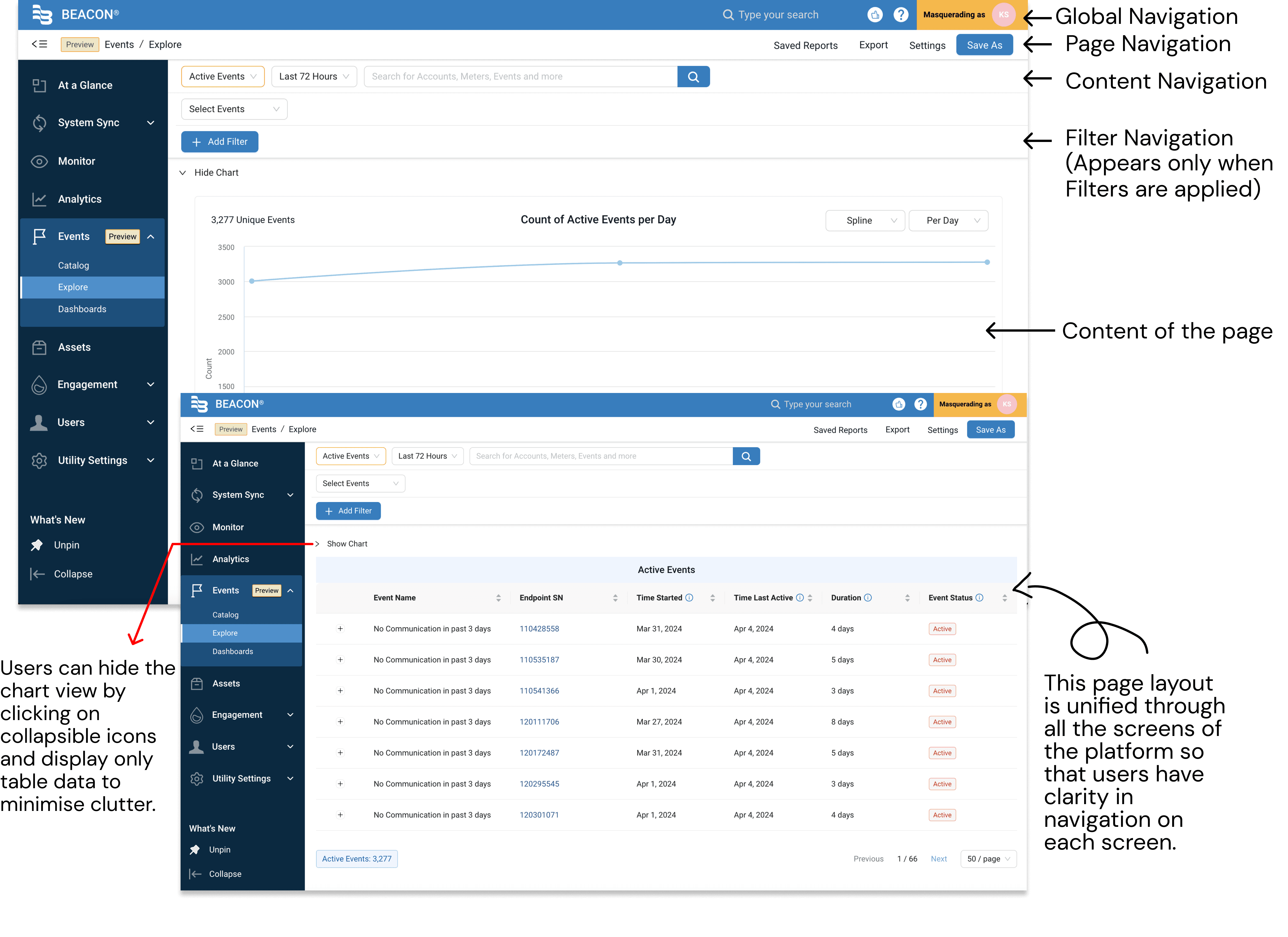
Explore Page
Effortless Data Comparison Across Two Tabs

Explore Page
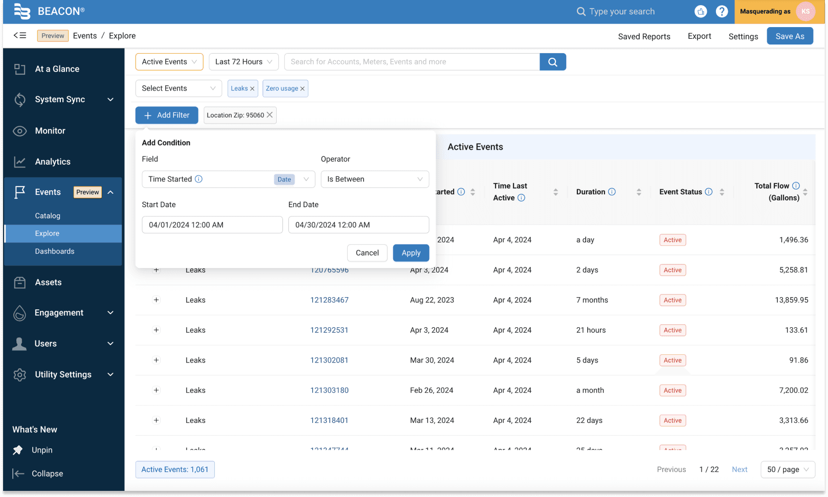
Exploring Data
Users can add Events (for meters), which are created to track the exceptions on the Events>Catalogue page.
Further Add conditions to get tailored details which would help to create work orders for specific accounts.
Explore Page
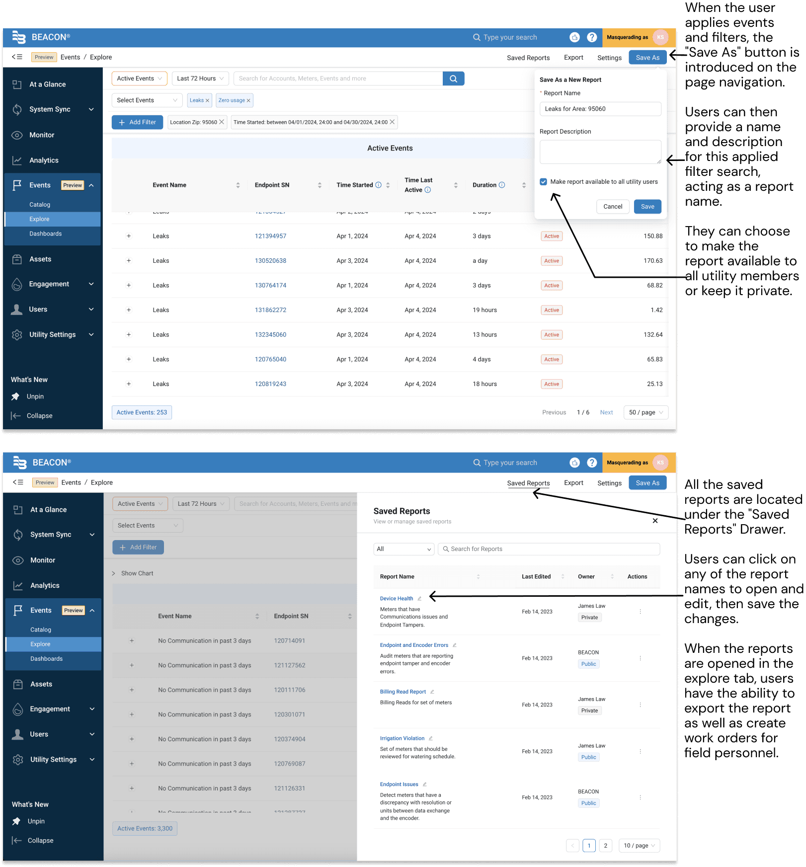
Report Generation for Work Order Creation
Users need to create and export a report in order to generate work orders for field personnel tasked with resolving exceptions. As users found the explore page more useful for obtaining explicit information about meters and accounts, I recognized an opportunity to introduce report creation on this page.
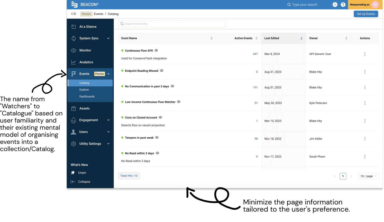
Catalogue Page
Watchers page converted to Catalogue of Events
User Flow
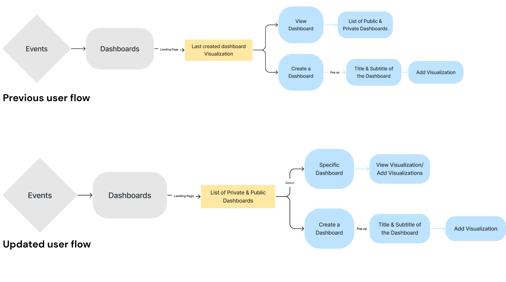
Dashboard flow improvements
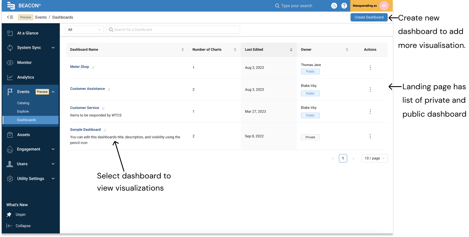
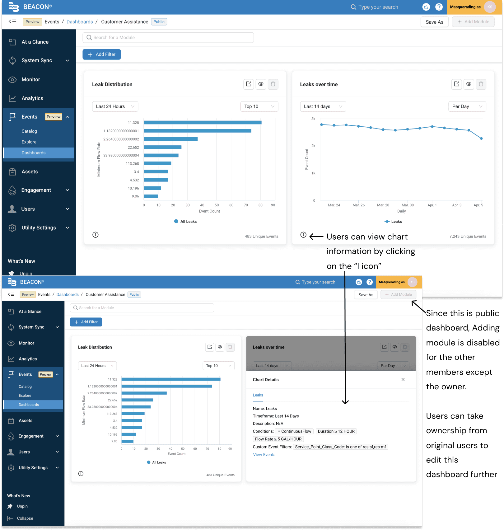
Dashboard Page
Dashboard landing page
Dashboard Page
Selected view of the Public Dashboard
Outcomes
The redesign increased user satisfaction by 85%, achieved 78% adoption of the report creation feature, and reduced support tickets by 35%. By introducing a streamlined report creation workflow and improving overall usability and navigation across the platform, the experience became more intuitive for utility teams and created a scalable foundation for future product growth.
Challenges
Users want direct access to all dashboards from the At a Glance (AAG) page, as they are familiar with its prebuilt visualizations. However, the dashboard UI is built on a new codebase, while the AAG visualizations use an older one. The disparate codebases create constraints, as integrating them directly would require significant development effort and could introduce technical complexities, risking system stability.
Next Steps
1. Event notifications research (Post-MVP): Conduct additional research on event notifiaction to better understand user needs and preferences, and to identify opportunities for feature enhancements and scalability.
2. Refine dashboard UX/UI: Prioritize improving the dashboard experience based on user feedback to enhance usability and meet expectations.
3. Revisit AAG page: After completing the dashboard enhancements, revisit the AAG page to seamlessly incorporate all dashboard functionalities.