Olivia app helps ADHD Women with tasks management, cycles, and community awareness.
My Role
UX/UI Designers
Organizer
SheDevOps, Women-led innovation org.
Responsibilities
User Research
User Experience Design
Design System
Usability Testing
Prototyping
Overview
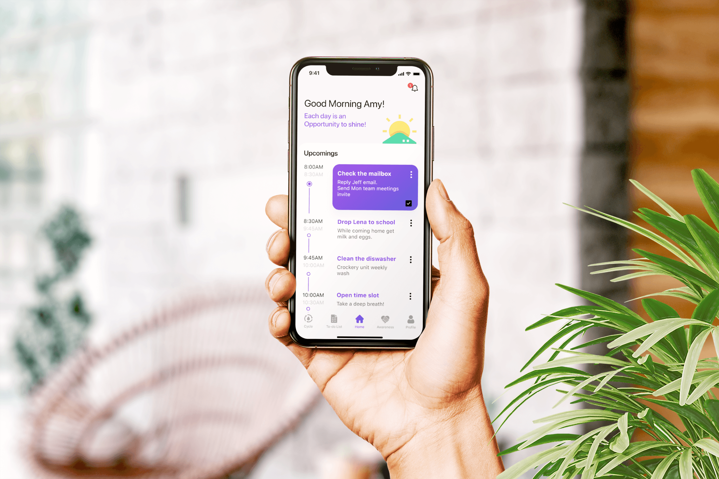
The Olivia app helps women who are diagnosed and not diagnosed with attention-deficit/hyperactivity disorder (ADHD) to remind their tasks, track the menstruation cycle, and spread awareness through connecting to the community.
Challenge
Attention-deficit/hyperactivity disorder (ADHD) is one of the most common childhood disorders and can continue through adolescence and into adulthood.
It affects women differently than men because of gender roles, hormone fluctuations, and a greater tendency towards self-doubt.
User Reasearch
Understanding users
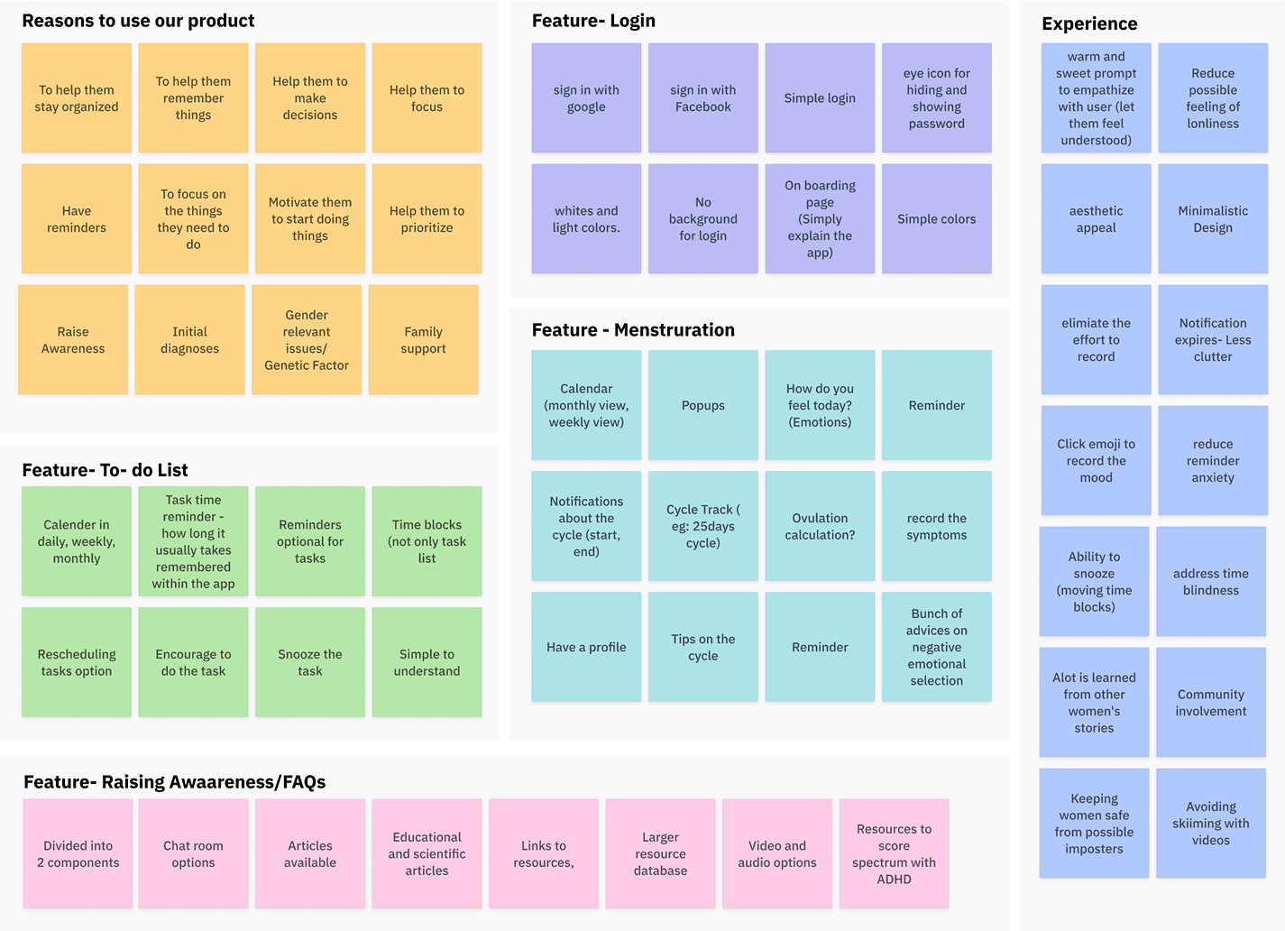
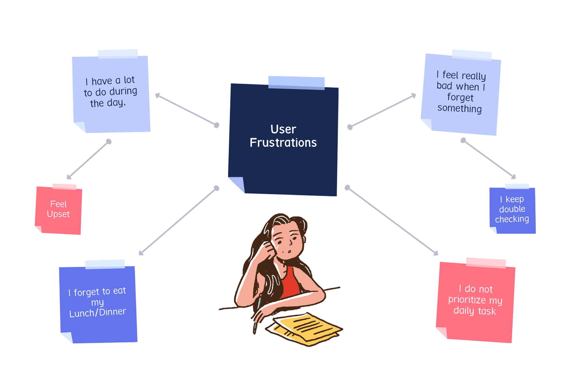
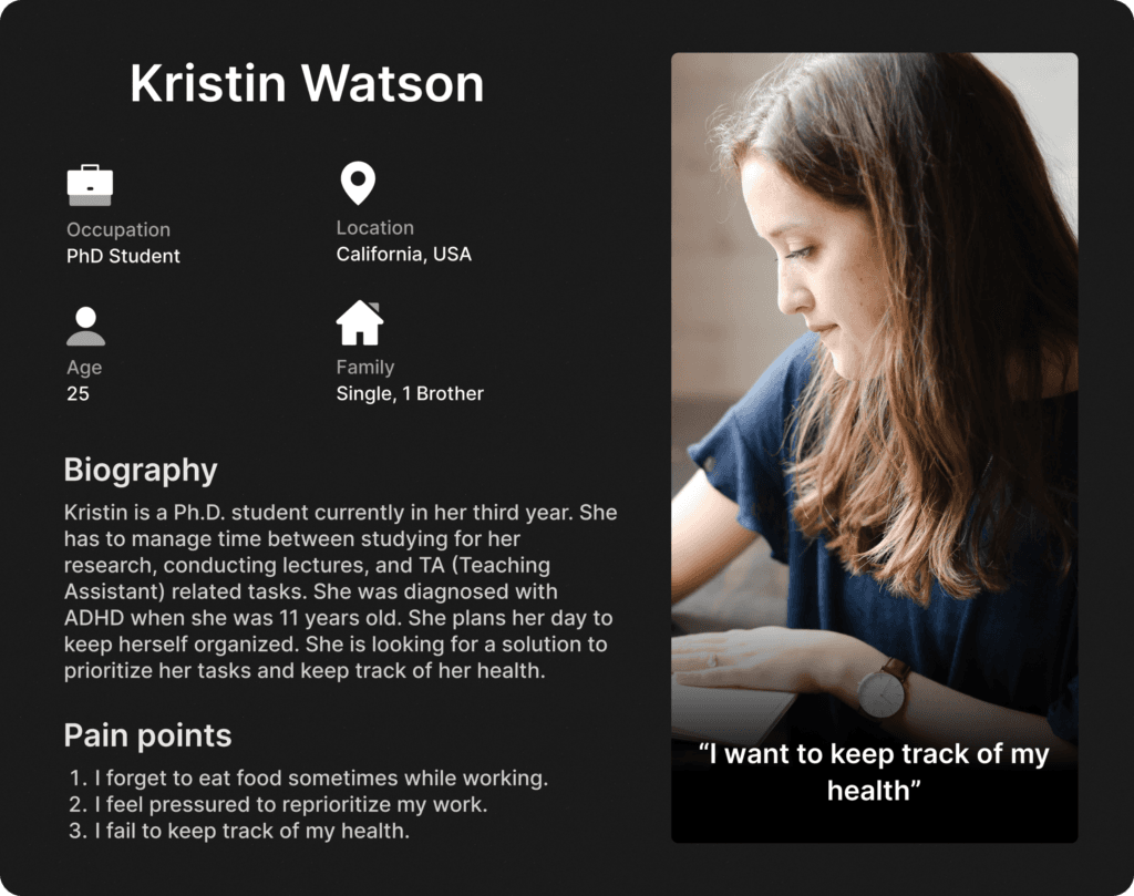
Following the Design Thinking process, I conducted four interviews with women diagnosed with ADHD and their supporters, and synthesized insights through affinity mapping to better understand user needs and pain points.
User Problems
User Persona
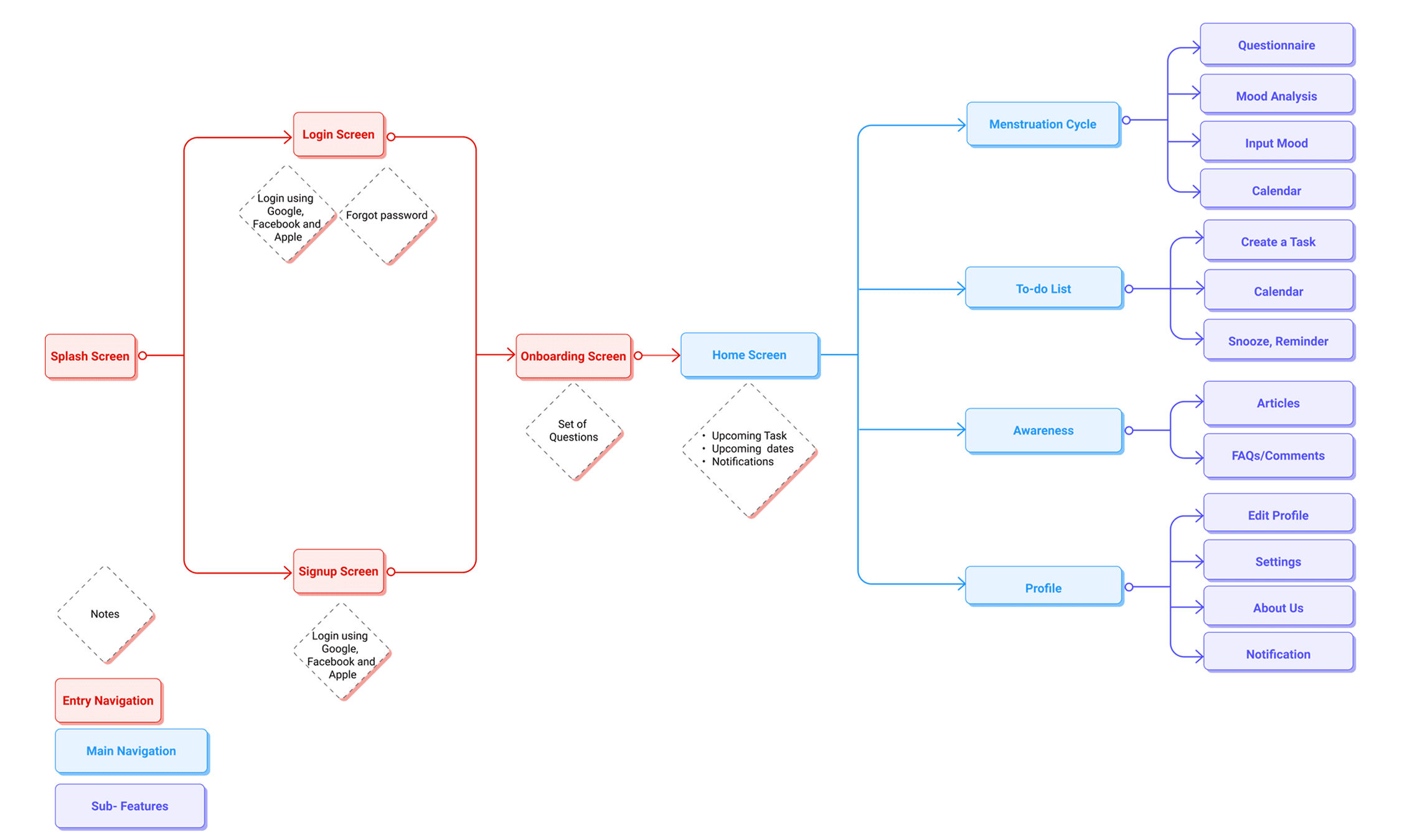
User Flow Diagram
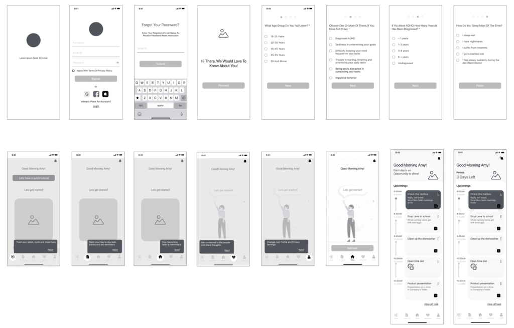
Lo-Fi Wireframes
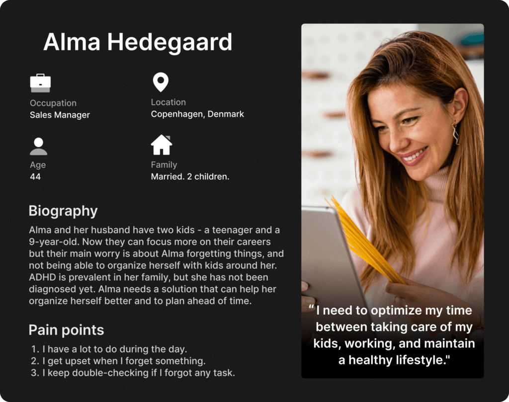
Using user personas and user flows as a guide, I sketched out wireframes using the Crazy 8 method. After multiple sessions, I picked the designs that I felt addressed the goals the best and digitalized them into prototypes for Usability Tests.
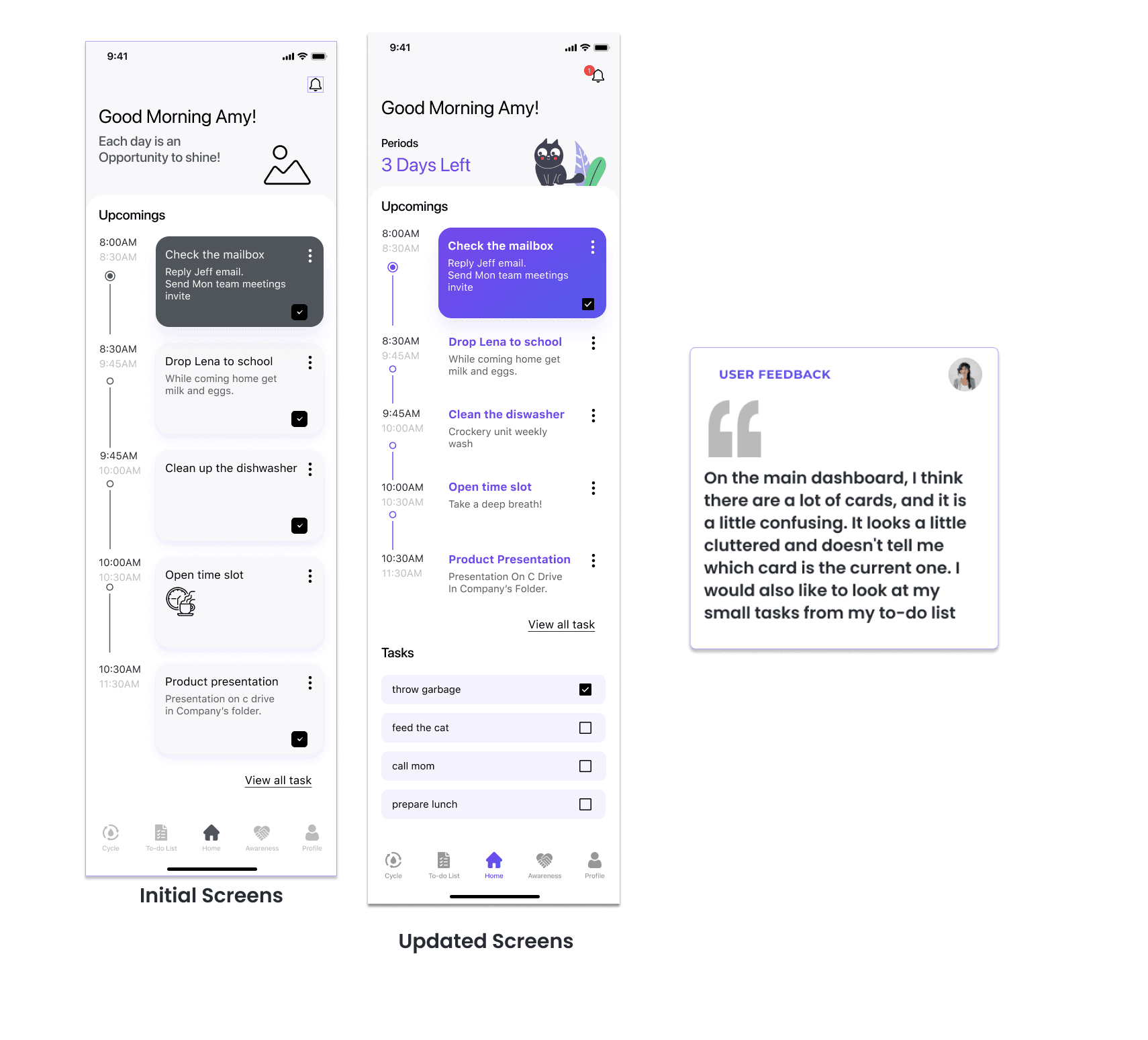
User Feedback
I established standard design components to maintain consistency and refined my wireframes based on feedback from two users.

Final Screen

Welcome Flow
The users preferred a simple, minimalist design for the splash screen. They wanted a white/plain background without an image, since it makes it difficult to read.
The users also requested Sign-in with Google, Apple, and Facebook, since it saves time and effort signing up.
New User Setup
After a user logs in for the first time, they are presented with a questionnaire that helps the app better understand them. These questions are mandatory, and therefore, I did not provide a “skip” option.
Since there is no “skip” option, I used four dots to indicate the number of questions.
For a few of the questions, I used the Radio button to indicate that the user can pick only one answer from the options.
For questions that can have multiple answers, I used checkboxes.


Onbording Flow
For first-time users, an onboarding screen helps users understand the navigation and functions of the app.
After completing the onboarding screen, the users are taken to the empty Dashboard. Users can add tasks that are displayed on the Dashboard.
Dashboard
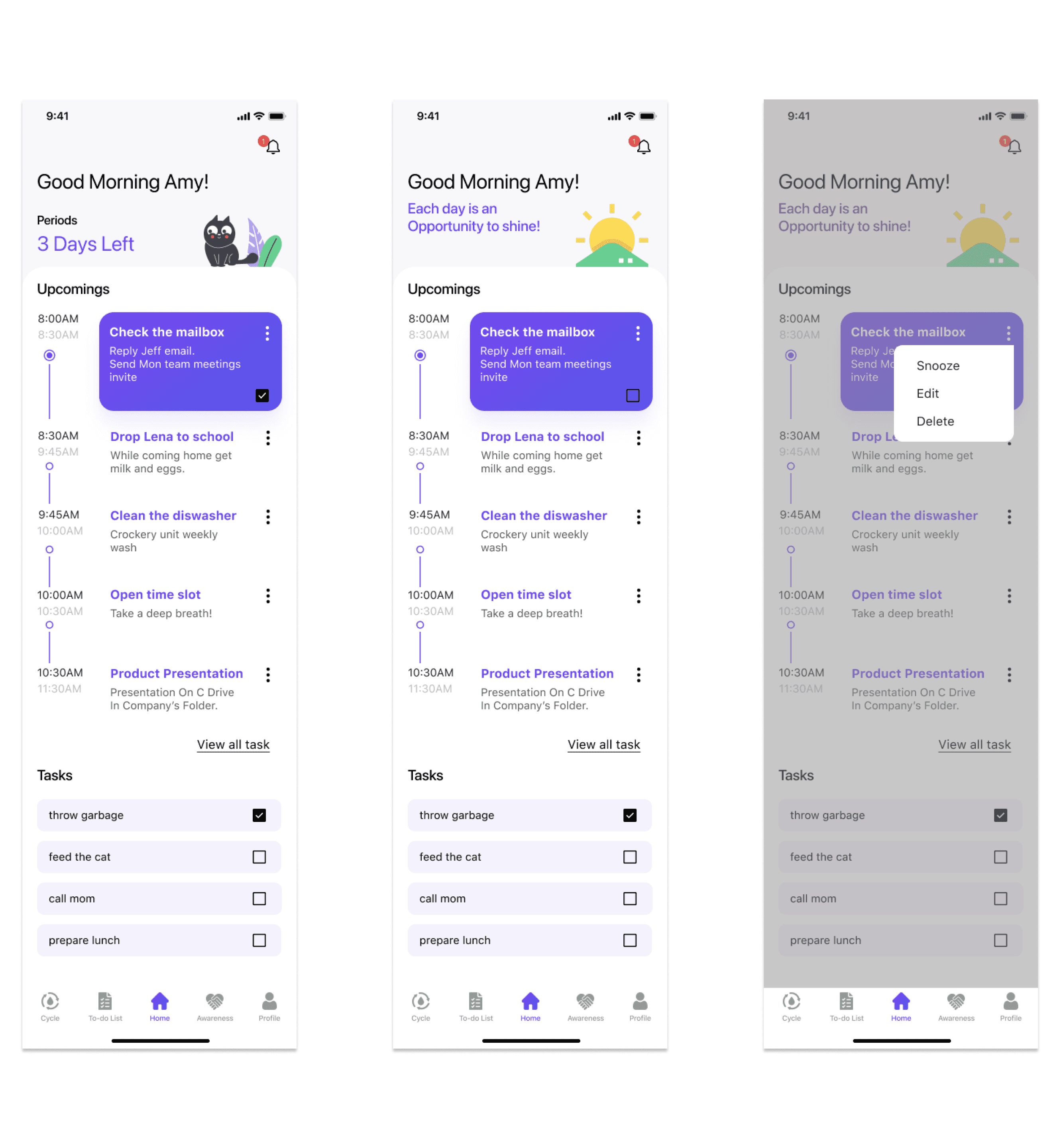
The Dashboard displays all the upcoming tasks and events of the user. Each task/event has a time duration associated with it that helps users better manage their day.
Another feature is that users can rearrange their tasks/events to help them reprioritize their daily schedule.

I have also added an option to add small tasks. These small tasks are displayed at the bottom of the screen. They can be completed throughout the day, whenever the user finds time.
It would also display the upcoming dates for periods of 3 days.
Users mentioned in their interviews that they feel good if they are motivated. So I thought of using some inspirational quotes on the dashboard in place of the upcoming period’s dates if they are not near the dates.
Accessibility
We designed keeping accessibility in mind:
The color palette and contrast meet Web Content Accessibility Guidelines.
Font sizes are legible, and buttons are large enough.
The Navigation bar and high-priority buttons are accessible with one hand.
What I learned
Simpler is better
When there aren’t too many similar existing apps in the marketplace, users can find it difficult to navigate through the app. A nice, clean, and minimal layout can help users get accustomed to the app easily.
Importance of the Design System
I learned the importance of the Design system when working in a team. Since everyone is working independently in different time zones, it helped a lot to be consistent with the entire product.
Communication is the key
As we are a team of 4 designers, keeping everyone on the same page is necessary but difficult. It was tricky to collaborate since all are remote teammates who are working in different time zones globally.
Next Steps
Moving forward, various additional features can be explored in the later stages.
Animation in the Micro Interactions could bring fun interaction to the user’s daily use of the app.
Synchronizing the events and tasks with Google Calendars on the phone.
Self-care tips in the menstruation cycle section.
The awareness section can have a chat feature.